
There are lots of articles on how to design a form, it is probably one of the hottest topics in UX design and marketing currently, because in a modern world conversion matters and a form can make or break it.
Form was and still is the most important communication tool between your site and the user. Whatever you do – register, send a message, purchase, file a complaint or change an address – there is a form for it which needs to be completed. This form should be simple, clear and fast to fill, otherwise the user might quit halfway through. If you are not a robot, producing a usable form is not as hard as it seems, but it does require some basic knowledge, which I will touch on in yet another form design article.
Form types.
There are three types of forms – social, commercial and utility. Social forms are registration forms to enter a community (Facebook, Twitter, etc.), commercial forms are quite typical purchase flow forms (Amazon, eBay) and utility forms are those you need to fill in to do some sort of action (government sites, online services). All these forms serve different objectives, but mostly follow the same three rules:
RULE 1: Make it quick.
In a few words: the shorter the form – the better. People do not like boring things and forms are considered boring 99% of the time, so keep them short and to the point. If there is some “optional” field / question / piece of data that is not crucial to you – then scrap it, keep the form clean and tidy and the user happy. Four to five fields is a good non-obstructive form that should work just fine. It helps to see the “Submit” button without scrolling too.
Pagination.
There are some cases where you need to ask lots of questions. Use form pagination and “Next” / “Back” navigation, but do not forget to show a breadcrumbs progress bar – how much is completed and how long is still to go until the form submission. Having an approximate time left to fill the form is also a good practice.
Make sure you group the form fields logically and divide these groups into pages so that nothing is breaking. If you do not have enough fields – do not even start with a pagination in a first place.

RULE 2: Make it clear.
This is again – quite an easy task if you think like a human being. Do not ask stupid questions, try not to confirm fields twice, Do not ask things just for your market analyst database, do not make the user read too much, but make sure everything is explained well enough, especially things that are uncommon.
Avoid Captcha whenever possible. It will prevent some people finishing the form.
Make sure you use easy-to-understand labels, group the fields accordingly to blocks (Personal, Addresses, etc.), good validation and inline help – these are crucial to any form and will reduce user frustration and the number of calls to your support team.
Labels.
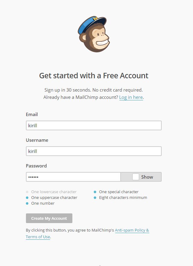
Most of the UX tests are done over the last decade, show that the best place is to have labels on top of the input and outside it. There is one problem with these tests – they are typically old web form evaluations that are a few years old, which are not so relevant now, when we have much more different screen sizes. The latest trend coming from the mobile platforms is to have the label inside the field – it saves vertical space, is easy to implement with a placeholder attribute, goes well with most of the layouts and really ties the label with the field. Furthermore, you can take it even further with some neat UI tricks (might be better suitable for an advanced user though).
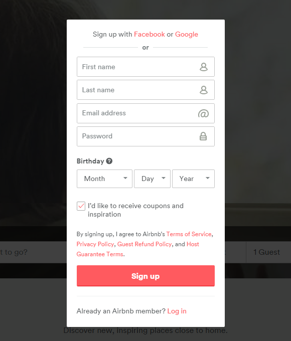
Placing the label on the left and input on the right is not advised, but still can be used successfully if you need the user to focus on a label more than usual. It will take more time for the user to read the label on the left from the input, but the data you get might be more detailed.
There is one more interesting label use case if you are aiming only for desktop users – having explanatory examples inside inputs (again – with a placeholder attribute) and having labels outside. This looks nice, but is a bit hard to scan and can be replaced with smart inputs.

Inputs.
Inputs should be easy to read as well as labels – easy meaning big enough to read and a good contrast against the background. The closer to the default OS input design – the better, do not reinvent the wheel, because making the form look fancier usually comes with the price of sacrificing usability.
Remember to have enough of the input width to fit most of the possible variations of text and make sure it accepts the necessary amount of characters.
The inputs should work with tabulation (use tabindex attribute) and you can also make them auto-advance where needed with a simple JavaScript. Be careful with this though, as it might cause quite a lot of problems.
Making inputs smart is a good way to minimise mistakes and confusion. There are lots of scripts to pre-format the content inside the input as the user enters it. One of the good examples of that is breaking the credit card number or phone number into a few groups of characters. It is not a very common practice unfortunately, but can help a lot.
Pre-formatting the content inside the input should also work well with the content validation. There are a lot of ways to show any errors, but the best might still be highlighting the field itself and having a line explaining the error below or near the input (just make sure the inputs and errors are visually connected). If the field is fine and good to go – you can also show a tick mark near it.
| Field | Pre-formatting | Validation |
| Name / surname | Pre-formatting | At least X characters, no weird symbols, go through most common variations |
| Username | – | Username is unique, not used before, at least X characters. |
| Password | Change from red to green accordingly. | Password is strong enough, show error before this one is fixed. |
| – | Validate the structure of the email (name@service.domain), probably validate the email server. | |
| Phone | Group the numbers, using relevant country format. | Only numbers and few special characters (+, -). |
| Address | – | Validate postcode and the address. |
| Credit card | Display the numbers in four character groups. Have the credit card type near the field (Visa, Mastercard, etc.) | Pre-validate credit card number if possible. |
| Any other field | Make sure to show the information in a way the user is accustomed to. | Validate everything you can (but keep it blazing fast, hopefully locally). |
Validating the fields is one of the most important things you can do to minimise the time to form completion, avoid possible mistakes and remove the annoying “Confirm details” page after the form (which is often a cause of a big conversion drop-out). Make sure you make it easy to understand and not too obstructive. Do not limit the user where it is not necessary and don’t push too hard.
Don’t slice one field to three (often done with dates). Have one field, a good idea is to have a flyout calendar picker.
Autofocus field, only if it is necessary and there is a functional need for it.
Captcha.
Captchas are like road bumps – don’t use them unless it’s absolutely necessary. Captchas are frustrating and hard to understand and it might cost you a customer. If it is absolutely necessary – then it’s good to use something familiar and widely used, not something that you consider fun or attractive yourself.
Unfortunately there are no good alternatives to Captcha, so as long as there are spam-bots – there’s going to be captchas.
Checkboxes and radio buttons.
Styling checkboxes and radio buttons is widely considered a bad practice, but is often necessary, as the default styling is really poor and often doesn’t provide the functionality needed. If you want to stay safe – don’t use styles, but personally, I don’t see a lot of problems with custom checkboxes, if they retain the shape and the behaviour of the original checkbox.
One thing to really keep in mind is to use labels with the correct names for the checkbox / radio button. Sometimes the graphical element is too small to click (mobile screens) so there should be a possibility to click on a label instead.
Inline help.
If the field is not one of the simple ones, then it is a good practice to provide help. Inline help should be short, to-the-point text, probably in a rollover tooltip.
Thank you page.
After the user have completed the form – thank them for taking time. It’s also a good place to have any additional messages about the account (“Check your email to confirm”), advertise features (“Back up to Dropbox”) or market other apps / Premium features.
Make sure you thank a person – use the name provided in the form, people like to be called by their name.
RULE 3: Make it usable.
Every form should be usable on every device, so try to make it so. If you have the resource to make it responsive – do it, if you don’t – then at least test the form thoroughly, check if all fields can be tapped in successfully, buttons work as expected, the keyboard does not hide half of the input and everything works well together. Filling in the form on a mobile is a big pain, so double check and evaluate it yourself – what an experience it is for you to fill out your form, and if there are any serious problems – spend some more time on it.
Markup.
Having a logical HTML markup is also quite crucial to a successful form, so try to use simple and preferably semantic markup. Use fieldsets, legends and labels for elements, not divs and other block elements. Use common ids for fields, so user could auto-complete some pieces of the form.
A good code to start with would be something like this:
<form>
	<fieldset>
		<legend>Details</legend>
		<label for="name">Name</label>
		<input type="text" id="name">
		<label for="email">Email</label>
		<input type="email" id="email">
	</fieldset>
	<button>Send</button>
</form>
Social identification.
It’s hard not to mention this relatively new and very effective way to simplify the process of registering (or logging in) – using the social services – Facebook, Google and others. It might not get you a lot of data, but it will make it very easy for the user to convert. It is easy to implement too, and the only con would be that you’d still need to have a usual form for some of your users who don’t have a corresponding social network user account.
But having social network authentication as an option would be a good addition to your main form.
Accessability.
There are a few ground rules for an accessible forms, which I’ve touched on already:
- Use big and simple fonts, do not use low-contrast elements. It is a good idea to have a text size switch too.
- Create a clear, logical markup – with careful and very clear labeling, naming the elements and ensuring keyboard / tab navigation works.
- Test the form thoroughly, on low contrast monitors, smaller viewports and involve more than a few users into this process.
As a summary.
From perspectives of anyone – a designer, developer or an end user, form is one of the most boring things they have to design or code or fill, but so far we haven’t created a better way to exchange information, so making the least obstructive form is the only way to make this process a bit more enjoyable (or at least – less painful). Form design tools are improving all the time and it’s a good thing to test and use them even though some might not work at first. After all the form design is a constant improvement over trial and error, a never-ending road to perfection, which requires your continuous attention. And if you do it right – it will work well for your business.