You’ve read before that I strongly recommend using native UI elements on different platform, and this is valid for fonts for any relatively big and complex website, desktop and mobile application too. In this article we focus on the CSS implementation for the web.
It’s true that some Windows (and Android) system fonts are pretty badly done, and definitely all of them are overexposed, but there are many good reasons to use them instead of going for something fancy and original. Every brand has their own rules for typography, and usually it is optimised for print only, ignoring the pitfalls of digital media. This, together with the brand manager’s wish for the brand to be original and engaging, makes a web designer’s job much harder. Below are a few of these good reasons to use system fonts and font-families instead.
System fonts are optimised for web and other digital media. This means that there are no problems with line heights, kerning and smoothing in any major browser right now. It will take a lot of time until all browsers render the fonts without sacrificing quality, and even the Google Fonts (which are pretty well done) are not as well optimised as most of the system fonts.
Secondly, system fonts have all the required characters for localisation and a sufficient number of different weights, so localising your website or app will be faster, simpler and more cost-efficient. Most of modern system fonts and font-families have at least light, regular, bold and italic weights, as well as all the required glyphs in their arsenal.
To make it a bit less idealistic, there is a small problem – there are lots of system fonts and you need to support most of them, so get ready to get your code dirty. On the other hand it’s not a big issue; after all, most of the system fonts share the same specifications.
Just as a reminder: the below table shows default fonts for different operating systems and their different versions. Please keep in mind that Microsoft added fonts and Apple and Google replaced the fonts, so on Windows machines you have quite a few legacy fonts, but on Mac OS X, iOS and Android there is just one font-family:
| OS | Available fonts | Best font to use |
| Windows XP | Tahoma, Arial | Arial |
| Windows Vista | Segoe UI (regular, italic, bold, bold italic), Calibri, Arial | Segoe UI |
| Windows 7 | Segoe UI (added Light and Semibold), Calibri, Arial | Segoe UI |
| Windows 8 | Segoe UI (added more weights and styles), Calibri, Arial | Segoe UI |
| Windows 10 | Arial Nova, Segoe UI, Calibri, Arial | Segoe UI |
| Mac OS | Lucida Grande | Lucida Grande |
| Mac OS Yosemite | Helvetica Neue, Lucida Grande | Helvetica Neue |
| Mac OS El Capitan | San Francisco, Helvetica Neue | San Francisco |
| Android 1.5-3.0 | Droid Sans | Droid Sans |
| Android 4.0+ | Roboto, Droid Sans | Roboto |
| iOS 6-8 | Helvetica Neue | Helvetica Neue |
| iOS 9+ | San Francisco, Helvetica Neue | San Francisco |
| Windows Phone | Segoe WP | Segoe WP |
| Ubuntu | Ubuntu | Ubuntu |
So if you are making a responsive web app for all devices, how should you target all these fonts in the right order? There are only two proper ways of doing this and both involving the font-family property.
First method
This one is the easiest and most careless, and it works most of the time; just have both “-apple-system” (for both Apple OSs) and “sans-serif” values in font-family property and it will select the most appropriate sans-serif font it can find (usually it is the system font).
For mobile platforms and for both Mac OS X and Ubuntu it works, but in Windows you’ll be stuck with glorious Arial. And yes – no light, semibold and other font weights on all platforms (except Android where you can use additional sans-serif-light, etc values), just basic ones. Semibold will default to bold and light to regular, so it’s not a major UX issue but not perfect.
font-family: -apple-system, sans-serif;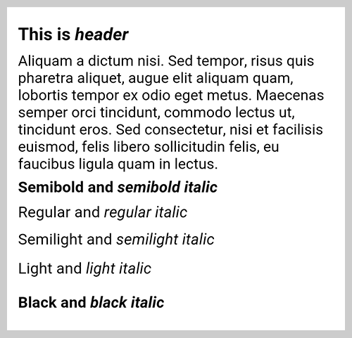
Second method
This one is a bit more complicated, but works much better. There are both values from the first method plus a fallback to all of the system font titles. It is more cumbersome and dirty, but it is supported by most of the browsers and gives close-to-perfect results. Windows Segoe UI works perfectly, Helveticas has no problem with all the weights, and even the Ubuntu works well. Sadly for Android, for font weights, you’d need to use the same additional value as in the first method, but the rest is ok.
font-family: -apple-system, "San Francisco", "Helvetica Neue", Helvetica, “Lucida Grande”, Roboto, “Segoe UI”, Arial, Ubuntu, sans-serif;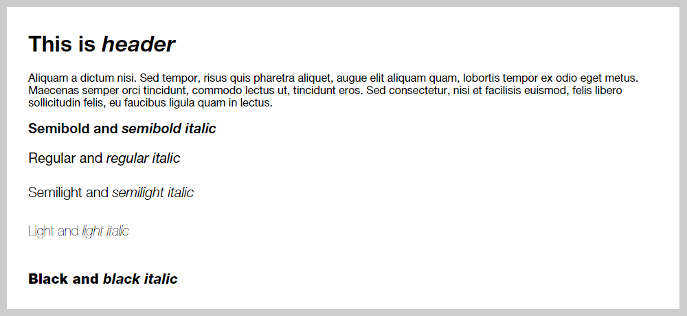
Easily this is my preferred way of using native fonts, and it is pretty bulletproof in most cases.
And this is it. There are a few other more complicated methods, but none of them work better than the above.
All in all, using system fonts and font-families is an easy way to keep your content looking native and comfortable to read. It is not hard to use system fonts, and I would definitely advise using them if your website has a lot of textual content.