In short: using a splash screen depends on a context, but in most cases – do not use one.
During my career I’ve done lots of splash screens for different apps, both mobile and desktop. This is not my proudest achievement as a designer – splash screens are evil and there is nothing good about them, so when I had the chance – I got rid of them in my apps.
Splash screen is an image that appears for a moment before the app is loaded. It’s more common in mobile apps and it takes up the whole screen, if it appears in desktop – it is generally smaller image in the center of the screen. Usually splash screen has some branding, a logo or an icon which are displayed before the app loads (or more frequently until the 3 second delay in code ends).

It’s hard to tell which app introduced the splash screen first, but there was a good reason for that – splash screen was a placeholder for an app while it loads. Some more advanced splash screens on desktop showed a progress bar or even the files being loaded at that very moment. This practice was picked up by mobile apps, firstly – on iOS, when, with poorly done ports, on Android too, but without the progress bar, because the majority of apps load up fast enough and the progress bar (and to be honest – the splash screen itself) is not really needed.
Just for fun – check the desktop splash screen archive on Guidebookgallery.
What big guys are doing?
Apple is definitely against splash screens: “As much as possible, avoid displaying a splash screen or other startup experience. It’s best when users can begin using your app immediately.” (iOS Human Interface Guidelines). Instead Apple UX designers are encouranging developers to use launch files (or images), which makes sense as they are not obstructive and mimic the app UI.
Interesting fact – most of the splash screens on mobile devices are originating from early iOS apps when iPhone could not handle fast loading of an app. It’s good that nowadays most of the apps are done right and load up in milliseconds.
Google has some mixed feelings about the splash screens. Before Android Lollipop the line was pretty strict: “Don’t use splash screens”. However recently Google designers changed their opinion, added simple splash screens with app icon to some of their most resource demanding apps (Youtube, Docs, Maps, and recently – Photos) and even created a Design Guide page for making splash screens calling these (surprise!) a “launch screen”. It cased a lot of interesting discussion, but the fact is – Google is not against the splash screens anymore and even uses it in some of it’s own apps in a strange way. Current sequence is – branded screen, then UI placeholder and only after that – the app itself.
Facebook and Twitter are constantly adding and removing splash screens, Linkedin is using (and probably always will use) a splash screen.
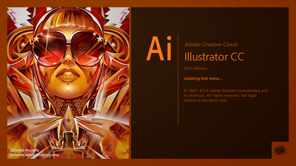
Microsoft and Adobe show a splash screen for their desktop apps.
So should your app use splash screens?
Probably yes, if you can’t load the app fast enough and need some time after starting the app. You should consider optimizing the startup time first though or use launch files instead.
Definitely yes, if you have a heavy desktop app with complicated UI. Desktop apps might run on a very outdated hardware, so the waiting time might be more that a couple of seconds. It’s better to have a loading indicator or at least some imagery.
Definitely no, if your app loads up fast and you care about user experience. Wasting 3 seconds of time for showing user the icon he just clicked on or a logo (of which he does not care) is a bad practice. Take the user straight to content instead, leave the brand for your corporate web site.
In my opinion the splash screen is something that noone will miss. And I think it’s pretty much the same for 99% of users.
PS. Here is Oatmeal take on Flash intros which also stands for the splash screens – “Websites with Flash intros”.


