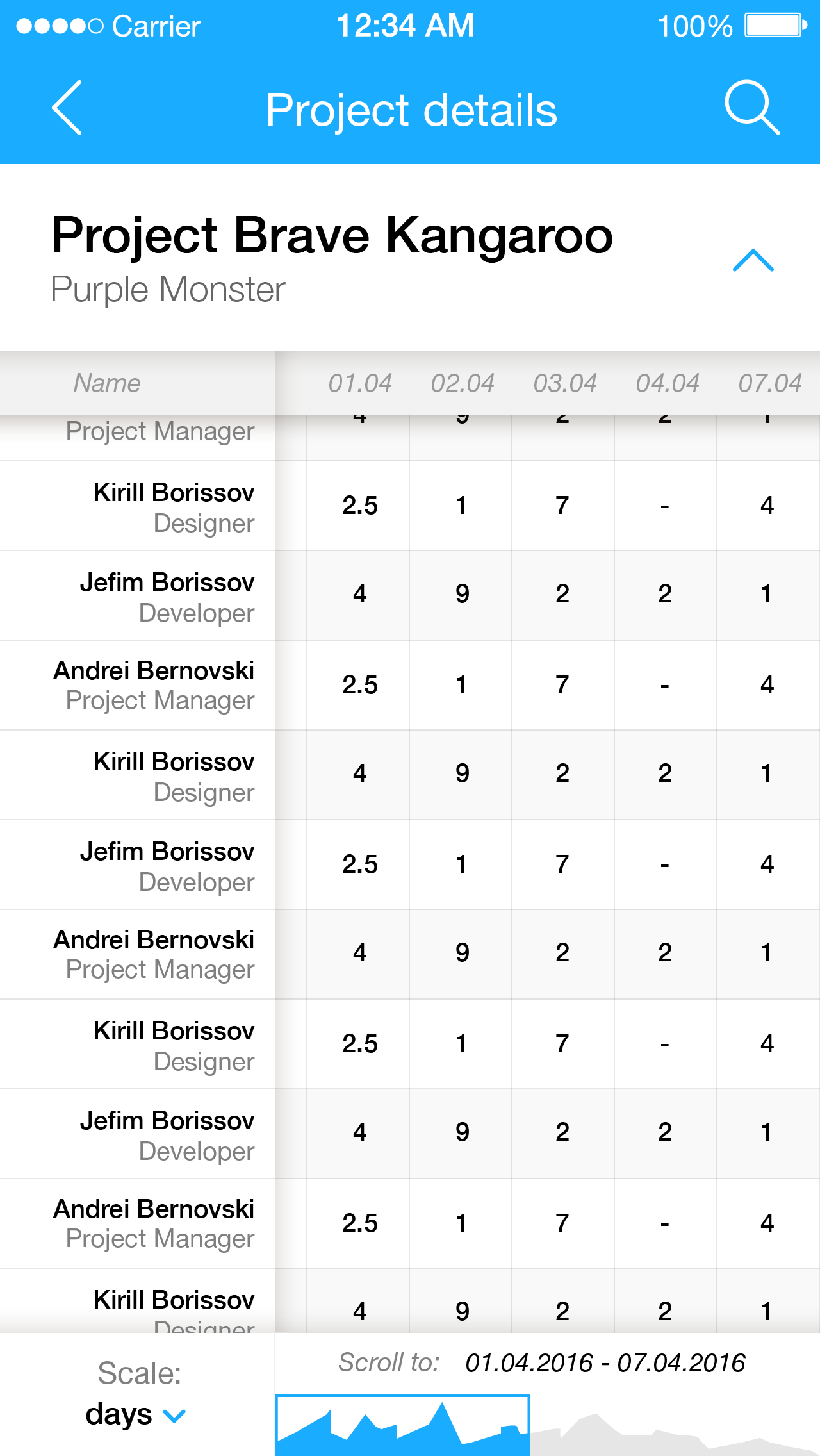
P&C is helping companies to keep their projects budgets on track using some easy-to-use effort tables with few integrations to keep things easy.
I was in charge of UX, visual design, brand, front end and all other things visual.
The interface is built for professional users, but I tried to make most important controls easily accessible and self-explanatory.
App design
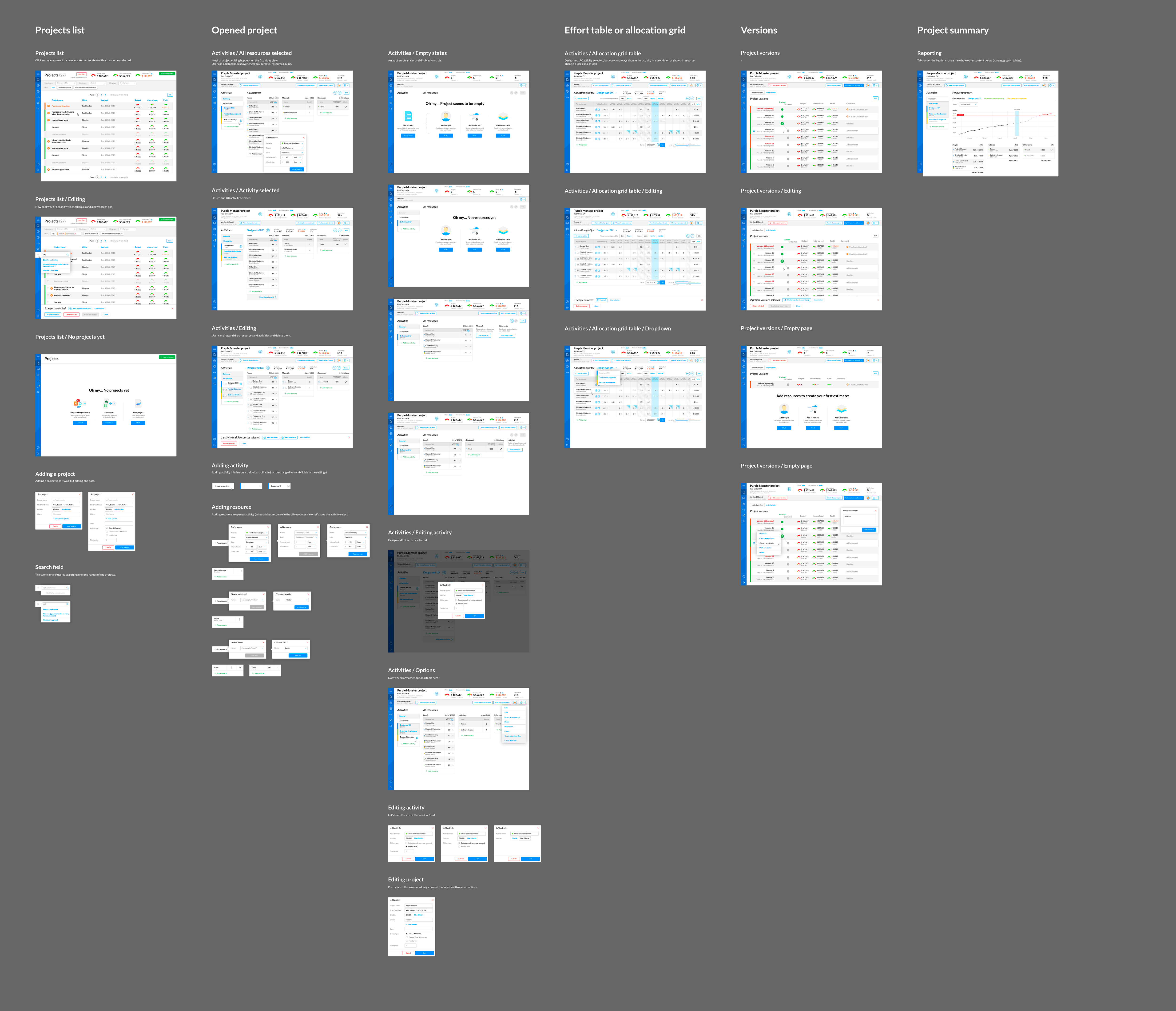
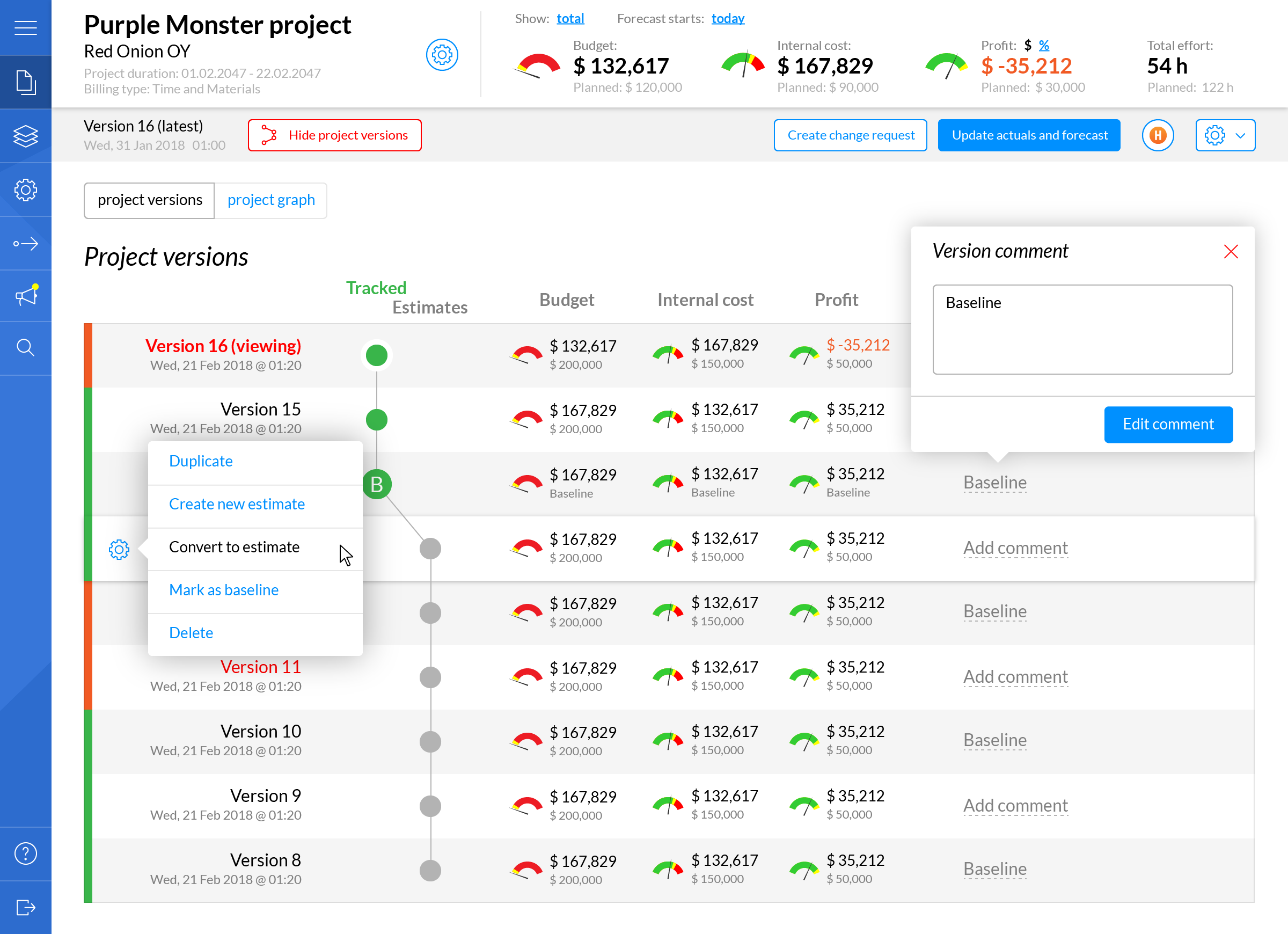
Overall style is flat and simple. The app itself has a lot of controls, tables, buttons and other small bits and pieces, so it was quite hard to make it clutter-free and focused. P&C is a professional tool but we’ve learned that even the toughest of project managers love simplicity :)).
Latest live version of the app can be found here.
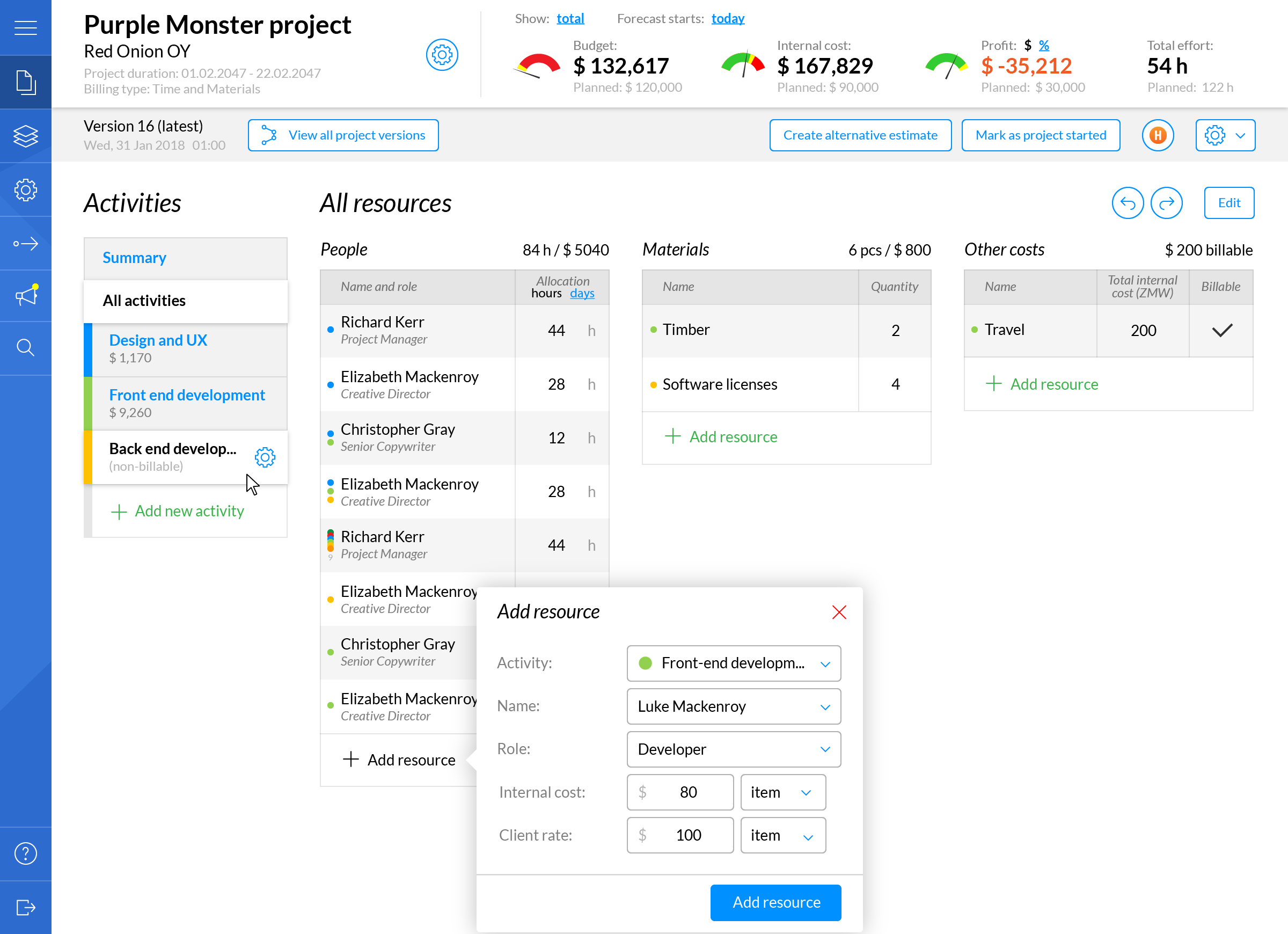
Adding an activity or any of 3 types of resources was one of the most used screens of the app:
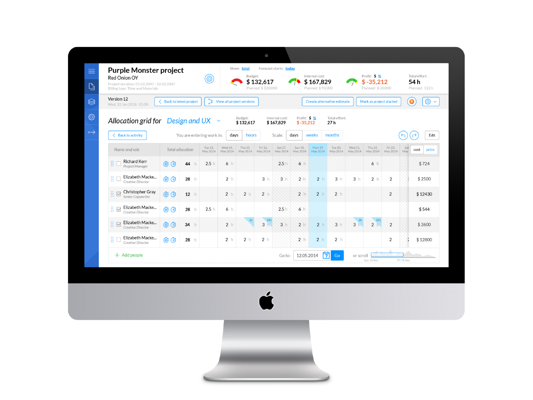
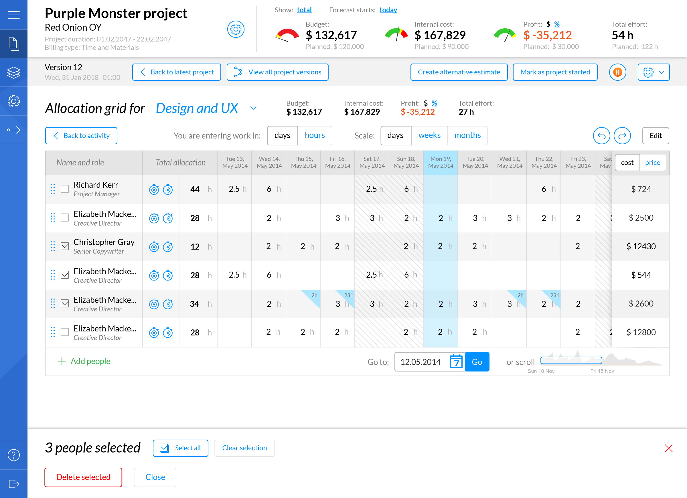
Effort screen has a lot of information, but still is quite readable and to the point:
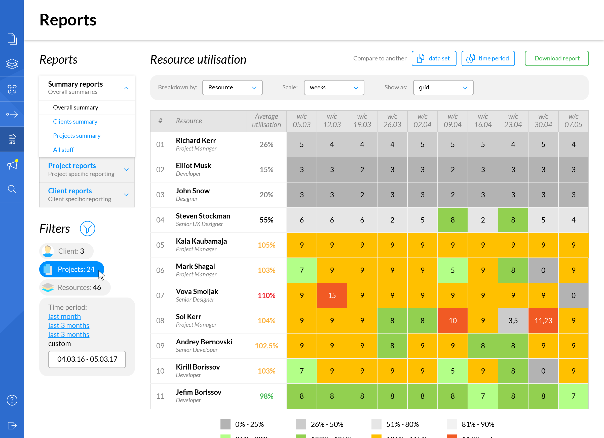
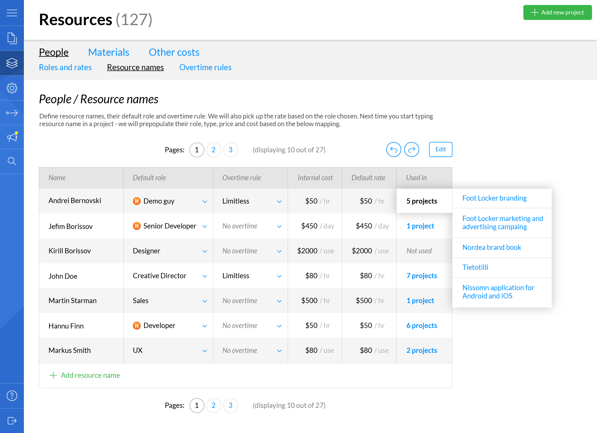
Few more screens of the app, including resource managers, reporting, project lists:
Mobile app
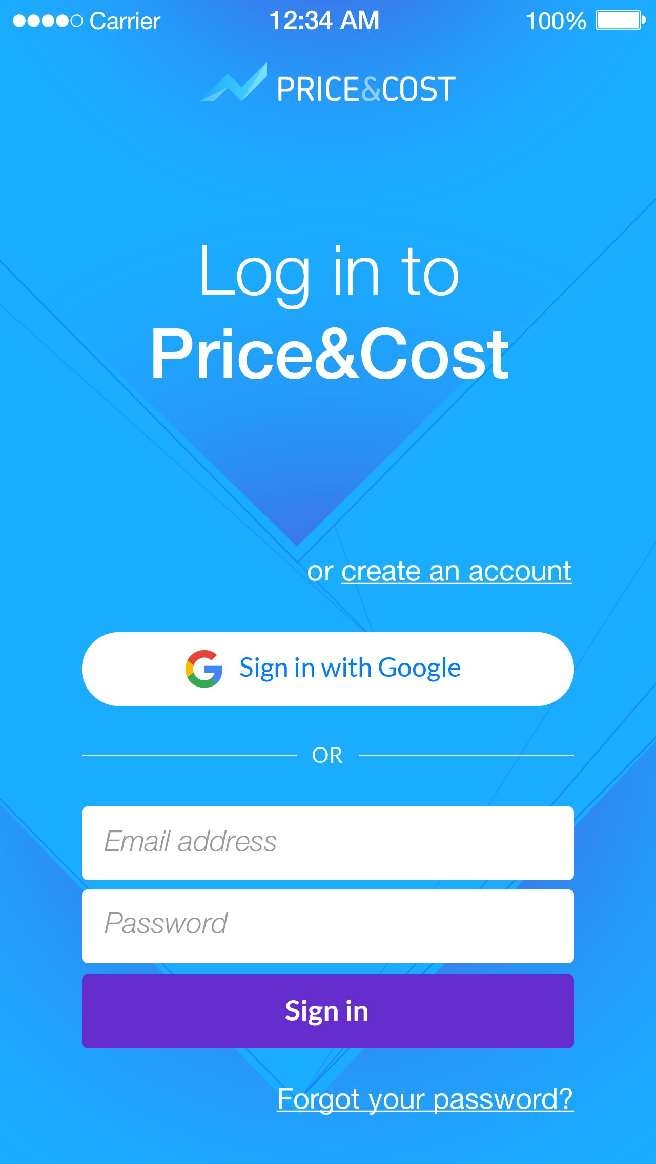
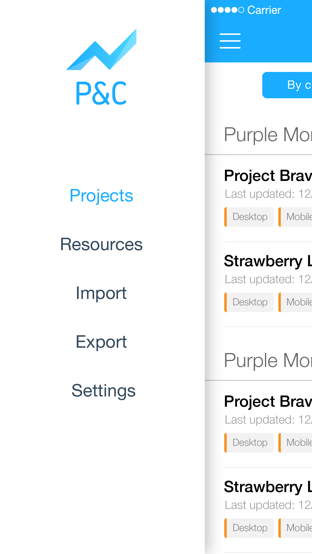
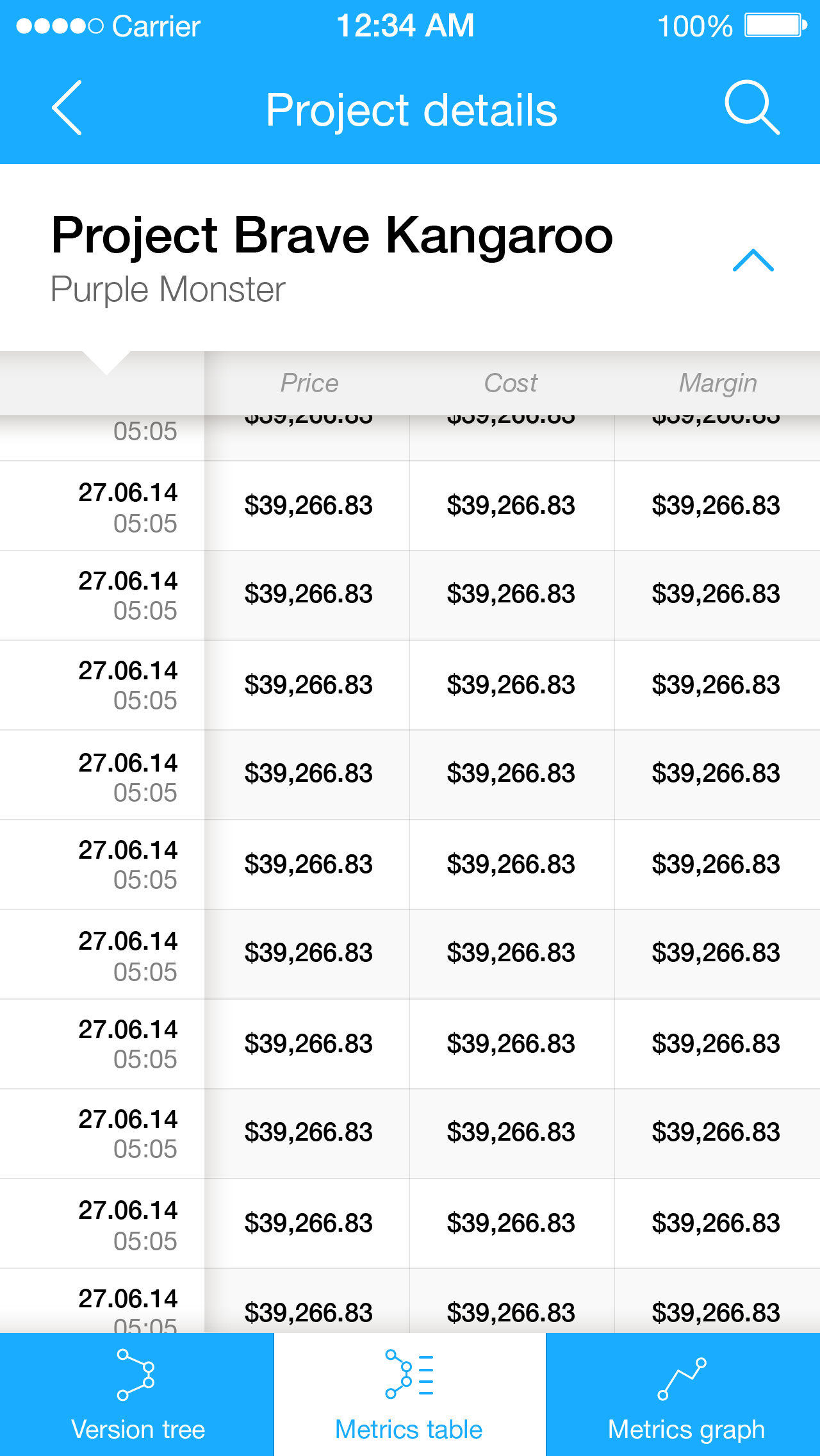
We’ve started designing a mobile app as well, but it is still in the works. However here are some unfinished mobile app views:
Web site
After a few iterations web site now looks quite cheerful and hopefully not so corporate.
Front page of the website (or you can check it yourself):

Just for the fun of it – one of the AI work files:
